Overall, I'm satisfied, yet very dissatisfied with the piece. I wish I had pushed the style further and had time to add even more details. I feel like the art nouveau doesn't convey me as an artist enough, although it was insanely challenging attempting to replicate this style. I am also more used to advertising graphic design, so to do something more illustrative was extremely straining. I'm just glad to have the project displayed for the final show, as I was confident that it did show off my skills as a graphic illustrator well enough.
Monday, November 25, 2013
Final Project Done!
After actually contemplating seppuku during the whole process, I finally filled in all of the missing details, colors, and shading on my piece. Although once again, unfortunately, I don't have any mid-process screenshots of the piece, my process was fairly simple and straightforward anyways. I first started by filling in large blocks of color (such as the background, circles couple, etc), and then slowly added the smaller details. I then went back and added the shading with a custom watercolor brush, trying to achieve the soft look associated with art nouveau.
Saturday, November 23, 2013
Response to Visual Symposium #11
This week's symposium covered creative writing and how they were common distinguished between poetry and prose. The lecture explored the many facets of thematic devices and elements used within both poetry and prose in order to communicate something to the reader. Although both writing styles can be used to convey possibly the same idea, prose relies more on diction and tone of the author, while poetry relies on the rhythm and sound of the words themselves.
The prose section of the lecture sought to defy the normal expectations of an A-B-A-B rhyme structure within lined poetry. It sought to illustrate how poets such as Tracie Morgan, uses repetition and rhythm in order to create emphasis, rather than word meaning themselves. Poetry has begun to defy many expectations of conventional form, using the placement of words on the page and syllables in key places in order to subtly affect the reader.
Leading the prose lecture, Professor Cyrus Console-Soican attempted to illustrate the blurred and faltering line between prose and poetry. He emphasized that it was not the structure that dictated the constraints for either style, but rather the subject matter: fact or fiction. In order to show this distinction to us, Cyrus showed us a video of Lydia Davis reading her book of short stories, Can't and Won't. Her writing style illustrated a lyrical, almost musical quality to her words that bordered upon poetry (when read aloud), but still retained the subject matters of prose.
The prose section of the lecture sought to defy the normal expectations of an A-B-A-B rhyme structure within lined poetry. It sought to illustrate how poets such as Tracie Morgan, uses repetition and rhythm in order to create emphasis, rather than word meaning themselves. Poetry has begun to defy many expectations of conventional form, using the placement of words on the page and syllables in key places in order to subtly affect the reader.
Leading the prose lecture, Professor Cyrus Console-Soican attempted to illustrate the blurred and faltering line between prose and poetry. He emphasized that it was not the structure that dictated the constraints for either style, but rather the subject matter: fact or fiction. In order to show this distinction to us, Cyrus showed us a video of Lydia Davis reading her book of short stories, Can't and Won't. Her writing style illustrated a lyrical, almost musical quality to her words that bordered upon poetry (when read aloud), but still retained the subject matters of prose.
Wednesday, November 20, 2013
Process of Final Project
Unfortunately I didn't take any good process photos or screenshots along the way (since I just kind of... go when it comes to my digital work. I tend to not enjoy the middle stages, so I forgot to document them). I only have one awful, blurry photo that I was taking with my phone to instagram (I know how to screenshot, I promise) and the initial sketches of the project I did in Photoshop.
The photo shows some of the line work and preliminary elements I had completed in the initial stages of the project.
Sunday, November 17, 2013
Research and Exploration Into the Final Project
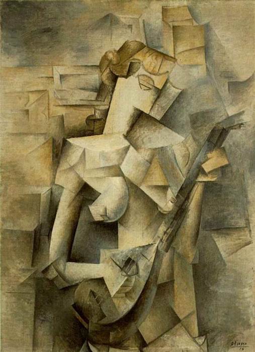
Before beginning my final, I extensively researched several art movements I was not familiar with, in hopes of being able to emulate their stylistic elements or messages. I first began researching Cubism, as I felt that it juxtaposed well with the concentric circles that were a recurring theme within my selected chapter of Einstein's Dreams. I thought it would been an interesting challenge to attempt to execute such a round, soft form using sharp, geometric angles and shapes within a digital medium.
However, I further researched Cubism, I came to a disappointing realization that I truly did not understand the execution or creative process of it. I realized that if I tried to emulate this style, it would ultimately fail. After this brief setback, Chris then told me to look into Constructivism, a movement I had not heard of before. Originating in Russia in 1919 and was the "rejection of autonomous art." I really enjoyed the placement of harsh geometric properties against a human subject, with strong, resounding text uniting the piece.
| "La Femme au Cheval" by Jean Metzinger |
| "Woman Playing Mandolin" by Pablo Picasso |
Despite my growing interest in this movement, I still wasn't sure if this was the look I desired. After researching this art movement further, I stumbled upon art nouveau. Although I had seen this style used by several artists before, I had never extensively looked into it before. I decided that with the soft, undulating curves and circles, this would be the style I wanted to use for my piece.
Friday, November 15, 2013
Response to Visual Symposium #10
Presented Miguel Rivera, this week's symposium covered the subject of printmaking and its familiarity among most practicing artists. Beginning with the history of Kansas City and its popularity with the medium, Rivera went on to elaborate how the styles of printmaking have integrated themselves with the aesthetic of the city.
Rivera then went on to provide examples of artists who had strong thematic statements using printmaking as their medium, such as Orit Hofshir's study of the detriments of erosion, to political awareness statements by other artists. The flexibility of the printmaking medium was emphasized, and how the medium transcends several boundaries of language and class in order to communicate effectively.
Monday, November 11, 2013
Proposed Schedule for Final Project
Following our reading of Einstein's Dreams, we were then required to select a chapter that was particularly poignant or interesting to us. Although several of us selected the same chapter as another person, there was no questions of plagiarism due to each of our individual ambitions. However, our ambitions had to limited with this project. Unlike our previous projects, we were restrained under a much shorter timeline. Previously we were given 3-4 weeks to complete each project. Unlike them, we only had 2 and a half weeks to fully plan and execute our final. In order to cope with with the limited time frame, we were required to create a schedule for ourselves, setting our own deadlines and goals.
Final Presentation of Personal Morals Prints
After putting our personal moral prints into our selected environment, we were then required to present our final products on ourselves and attend a photoshoot. We helped set up a grey backdrop in order to pose in front of, and then had Chris photograph us all.
Once the photoshoot was done, we then hung all of our final prints and fabric prints up in the gallery space to display our work.
Subscribe to:
Posts (Atom)